Research breakdowns, practical implementation notes, and opinionated takes from real-world data and AI work.
-
Day 94
Multilevel Analysis Word multi refer to many time aka stages. Multilevel analysis focus nested source and complex data. It has 2 components:…
-
AI Tinkerers Kuala Lumpur #1
When: Sun 2024-05-12 6pm – 7pm (MYT)Where: Agmo Space, Multimedia University – MMU Cyberjaya, Persiaran Multimedia, 63000 Cyberjaya, Selangor
-
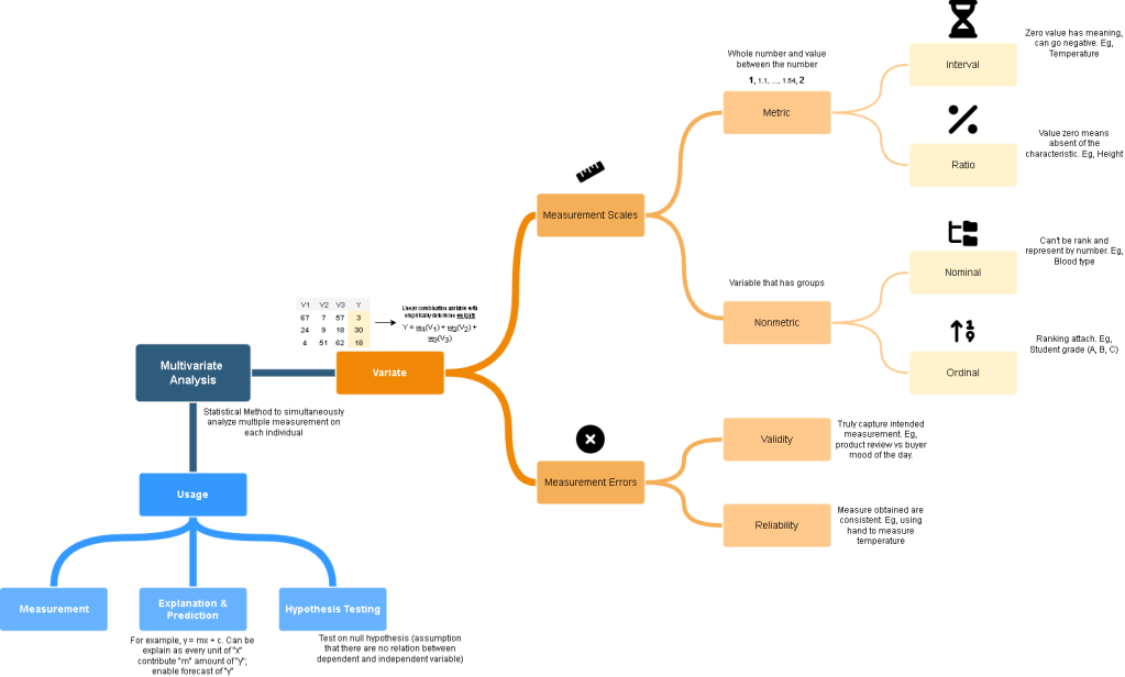
Multivariate Methods for Data Analysis
Day 68 Type of Multivariate Techniques Day 69 Statistical Significance and PowerPowerMultiple RegressionStep to form Regression Day 70 Tutorial Day 71 Factor…
-
-
Day 75
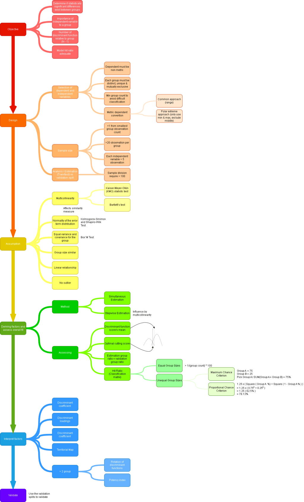
Multiple Discriminant Analysis ps. Classify observation into groups (non metric). SPSS Step 1. Normality of the independent variable distribution test result. Note…
-
-

Day 73
Cluster Analysis ps. Group similar objects/observations based on the characteristic in a cluster that different to other object in other cluster. Also…
-
Day 72
Tutorial 2 Question 1 Example Answer Exclude Q7 and Q8 Exclude Q6 as it is cross loading, show almost similar magnitude in…
-
Day 71
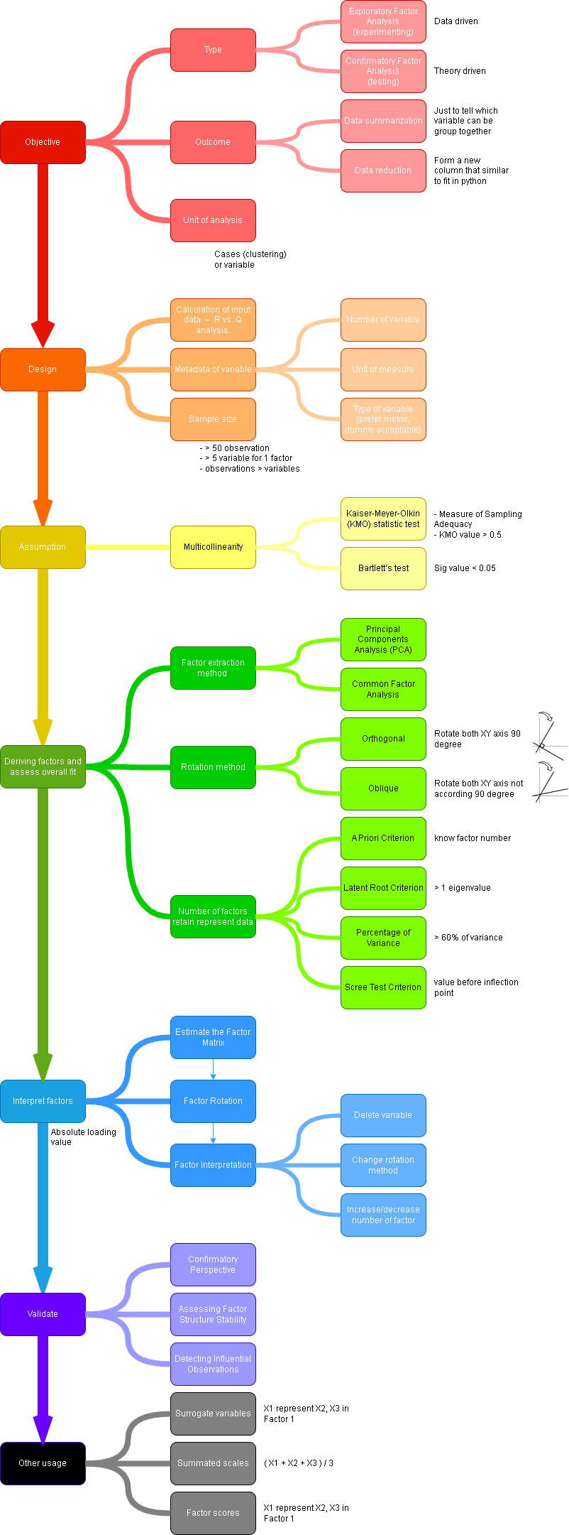
Factor Analysis ps. Not looking the effect of 1 variable to another variable. Only looking at how to group variable together that…
-
Day 70
Tutorial 1 Question 1 Example Answer Question 2 Example Answer Exclude Pulse Exclude BSA By using stepwise method, independent variable are introduce/remove…
-
Day 69
Statistical Significance and Power ps. This is to explain the consequences of making wrong judgement on statistical test. H0 is True H0…
-