
Time Series
4 Components that made up time series

1. Irregular fluctuations – Does not follow any available pattern and not predictable; normally short period. Eg. Rise in the steel due the strike in the factory.
2. Cyclical – Large sine wave cycle about 8-10 year. Exhibit 4 phases (Peak → Recession → Depression → Expansion) repeatedly. Eg. Economy crisis.

3. Recurring/Seasonal – exhibit regular pattern over a period (eg. 1 year) ps. also predictable. Eg. Sales of pullovers is relatively higher in winter than in summer.

4. Trend – Positive/Negative general trend summarized from all the data point/overtime. Eg. World population increases in the recent years.
An upwarding movement across the time horizon. Repeated patterns with a seasonal peak and seasonal trough in one year. Unpredictable movement in a short period.
Method to explain a time series.
Stationary Test
In order to process time series dataset effectively, it has to be stationary. E.g to have better model to forecast. Following criteria must be satisfy in order to classify as stationary
| constant mean |  | most of the point fall intercept mean |
| constant variance |  | upper and lower limit consistent flat overtime |
| constant covariance |  | distance between 2 point same across all |
| auto correlation | 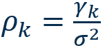 |
To show or illustrate data pattern is stationary, Correlogram (Autocorrelation Function [ACF] & [PACF]) is used.
R
Kindly note that “forecast” library installed.
In a previous class, “imported_earthquakes” had been visualized for time series plot. Using the same dataset, and the autocorrelation function (acf) was applied to assess stationarity.
acf(
    imported_earthquakes,
    ylim=c(-1,1),
    xlim=c(0,100)
)
ps. “acf” start from lag 0, “Acf” start from lag 1.
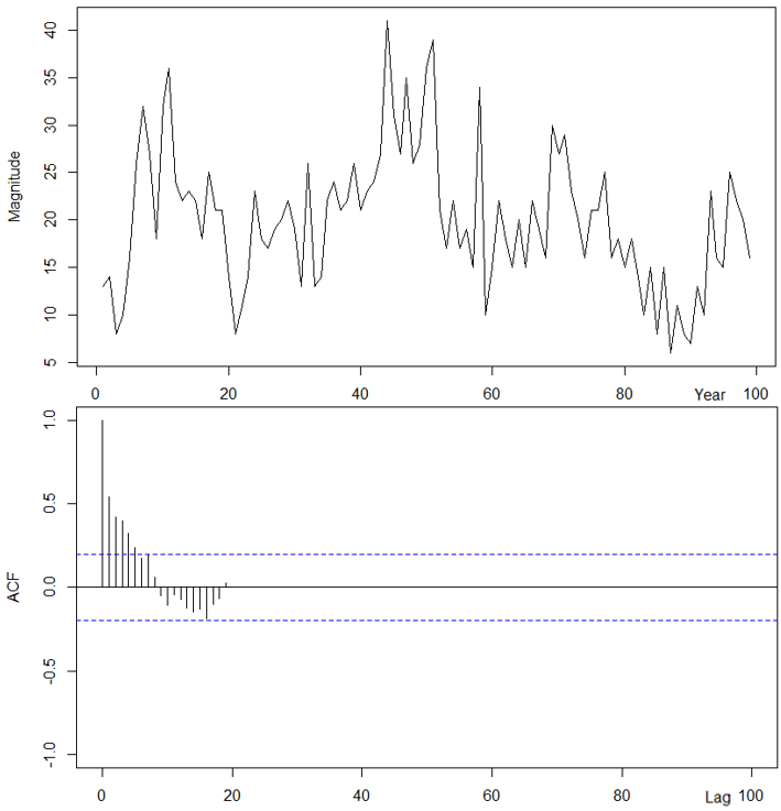
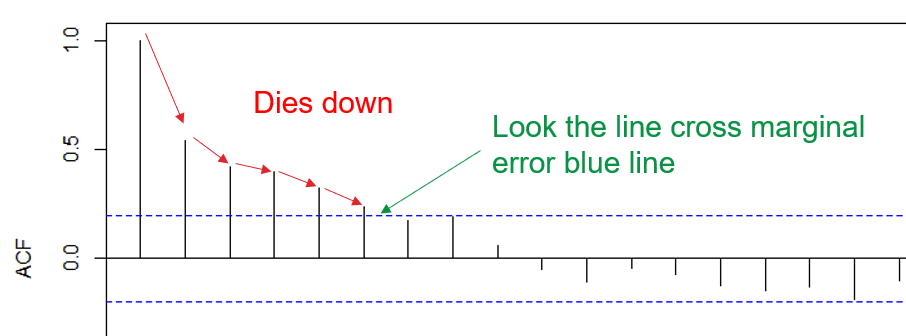
The dataset suggest that it is not stationary as “dies down” was observed.
What we anticipating is “cuts off”, not a slowly downwards trend.

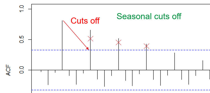
Sometime, “dies down” are hard to be identify using human justification; Therefore “adf” test. Before heading to “adf”, we must understand what ACF plot was doing.

1. Calc lag, here is what it means point 1 vs other point.
2. Aggregate all the lag to form

3. And we can compare the same result as in R script.
acf(
imported_earthquakes,
ylim=c(-1,1)
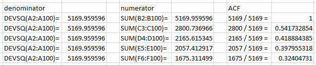
)$acfTo fully understand how the calculation, kindly refer to Sangwoo.Statistics Kim video about “504 How to calculate ACF by 2 ways in Excel”. It is a very clear and crispy explanation on how ACF were calculated.
Do take note that same dataset, different row will affect how the acf result.
Trend stationary check
ndiffs(data) → return estimated number of difference require for stationarity; more than 0 equal not station.

ndiffs(
 imported_earthquakes
)
Kindly note that “tseries” library installed.

adf.test(data) → perform adf test to check data is stationary, p-value < 0.05 means reject h-null (null hypothesis) aka stationary; vice versa.

adf.test(
 imported_earthquakes
)
Seasonality stationary check
ndiffs(data) → return estimated number of difference require for stationarity; more than 0 equal not station.

nsdiffs(
 imported_sales
)
Kindly note that “uroot” library installed.

ch.test(data) → perform adf test to check seasonal data is stationary, p-value < 0.05 means reject h-null (null hypothesis) aka stationary; vice versa; or can rely on “*” to tell station.

ch.test(
 imported_sales
)
How to station the data?
In this case, this step seems like log transformation in modeling; removing irregularity and those slowly growing effects.
- Differencing
- Logarithmic – does not change shape and pattern from the original data, reduction in the wide range.
R
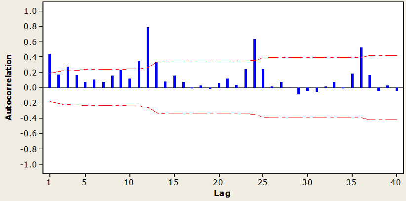
Earlier class, “imported_sales” show there are some quarterly seasonality signal.
acf(
    imported_sales,
    ylim=c(-1,1),
    lag.max=36
)

By using “diff” function, seasonality can be transformed into station. Value “4” in the parameter means that 4 in quarter.
Acf(
  diff(
    imported_sales,
    4),
  lag.max=36
)
Same as other test, all will show non stationary had been removed.
adf.test(diff(imported_sales, 4))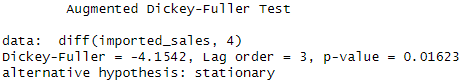
ch.test(diff(imported_sales, 4))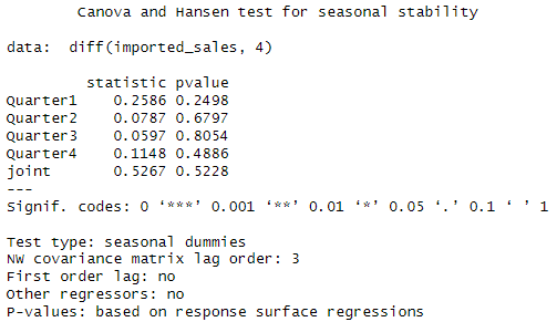
ps. still not clear after transformation, how to use the values to perform prediction.
Forecast

Base on period to perform forecasting, different method were applied based on “number” of data available. Eg. Market research and survey would be more useful than model prediction as when the operation just started. Quantitative models often require complete dataset.
| Qualitative | Quantitative | |
|---|---|---|
| Characteristic | Human judgement, opinions, subjective, nonmathematical | Based on mathematics |
| Strength | Responsive to environment and “insider” information | Consistent, objective, able to incorporate more data into algorithm |
| Weakness | Human causes bias | Limited by data |
| Method | Executive Opinion, Market Research, Delphi method (appointed expert/consultant for prediction) | Moving Average, Simple Exponential Smoothing, Linear Regression, Holt’s Method, Additive Decomposition, Multiplicative Decomposition, Winter Holt’s Method, ARIMA ps. Demonstrated in later class. |
Consequences of incorrect forecasting
- Overforecasting – Excessive inventory, overproduction, cash flow shortage
- Underforecasting – losing opportunity, underproduction
7 Steps to perform successful forecast
- Objective, purpose
- Item, parameter to forecast
- Time horizon for forecast
- Select model
- Gather data
- Perform forecast
- Validate and implement result
Tutorial 1
Question 1
State the differences between objective and subjective forecasting.
Example Answer
Objective forecasting is based on mathematical and data at one time; subjective forecasting is based on human judgement.
Question 2
What are the consequences of incorrect forecasting?
Example Answer
Over-forecasting may lead to excessive inventory and under-forecasting may losing customers to the competitors.
Question 3
State all the classical approach of time series with explanations.
Example Answer
Time series analysis – don’t require big size of data (topic 2)
Regression analysis – sometime we need to analysis distribution of data
ARIMA models – must have stationary property
Question 4
Patterns in the ______ is used to analyze the key feature of the data.
Example Answer
Time series plot
Question 5
Plot the graph of the autocorrelations for various lags of time series for the following:
(a) Random data
(b) Stationary data
(c) Trend data
(d) Seasonal data
Explain in detail the autocorrelations pattern for part (a), (b), (c) and (d) above.
Example Answer
Stationary data
Trend data

Seasonal data
Question 6
State all the properties of stationary time series data. If the time series data is not stationary, what method should be used to make the data stationary? Explain your answer.
Example Answer
Constant mean, constant variance and constant covariance.
Transform the data with first order differencing. If the differenced series remains not stationary, we will take the second order differencing.
Question 7
Construct autocorrelation function (ACF) plot to explore the data pattern for the below data. Check whether the series is stationary. If not, transform the series to stationary. You may require using appropriate statistical tests (adf.test or ch.test) to support your results.
(a) USABeerproduction.csv – monthly beer production (in ‘000 units).
head(myts)
| Jan | Feb | Mar | Apr | May | Jun | |
| 1970 | 13.092 | 11.978 | 11.609 | 10.812 | 8.536 | 9.617 |
Example Answer
imported_beerproduction = ts(USABeerproduction$beerproductionusa,
                             start=1970,
                             frequency=12)
plot(imported_beerproduction)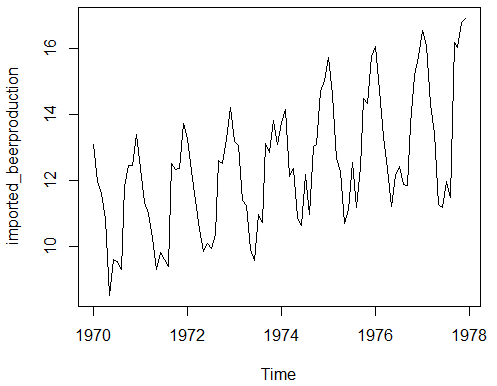
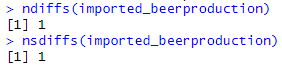
both ndiffs and nsdiff show that the dataset is not stationary. But we cannot use 1 as difference, instead 12 is the more accurate value.
ndiffs(imported_beerproduction)
nsdiffs(imported_beerproduction)
Result:
| Before | After |
|---|---|
Acf(imported_beerproduction, lag.max=60) | Acf(diff(imported_beerproduction, 12), lag.max=60)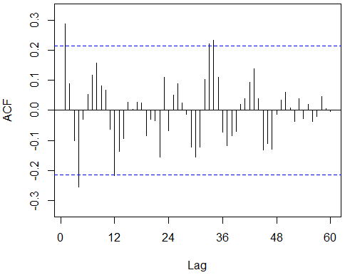 |
adf.test(imported_beerproduction)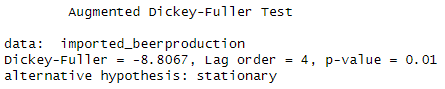 Note that although adf test show p-value = 0.01, the seasonality stationary failed. | adf.test(diff(imported_beerproduction, 12)) |
ch.test(imported_beerproduction)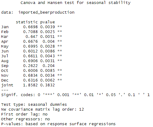 | ch.test(diff(imported_beerproduction, 12))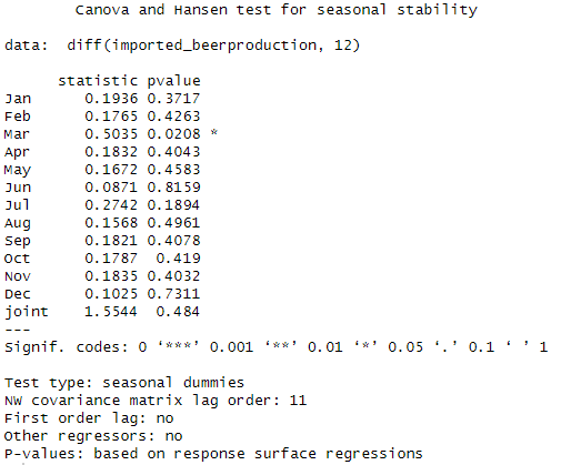 |
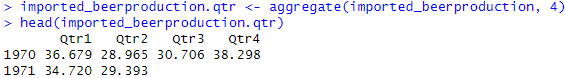
(b) Convert the USABeerproduction.csv into quarterly data
head(myts.qtr)
| Qtr1 | Qtr2 | Qtr3 | Qtr4 | |
| 1970 | 36.679 | 28.965 | 30.706 | 38.298 |
| 1971 | 34.720 | 29.393 |
Example Answer
imported_beerproduction.qtr <- aggregate(imported_beerproduction, 4)
head(imported_beerproduction.qtr)
Result:

Leave a comment