
Objective of time series
- Describe – visualize current data
- Forecast – create continues data point at the end of chart
- Improve
Time Series Chart
- in regular interval, eg. 5s, 5s, 5s; not 5s, 10s, 3s.
Excel
1. Raw Data
| Year | Quarter 1 | Quarter 2 | Quarter 3 | Quarter 4 |
|---|---|---|---|---|
| 1 | 667 | 631 | 675 | 699 |
| 2 | 739 | 695 | 751 | 779 |
| 3 | 823 | 795 | 835 | 875 |
| 4 | 931 | 855 | 939 | 967 |

2. Copy & paste again but holding “Ctrl” button
3. Click on “Transpose” button
4. Copy and format accordingly.
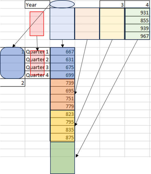
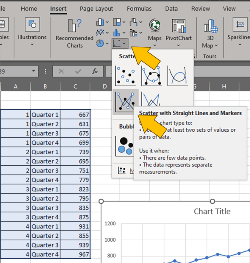
5. Create scatter plot
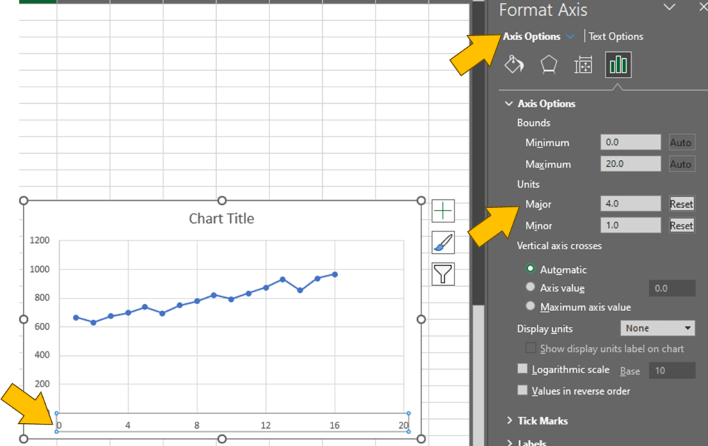
6. Modify Major Axis Tick
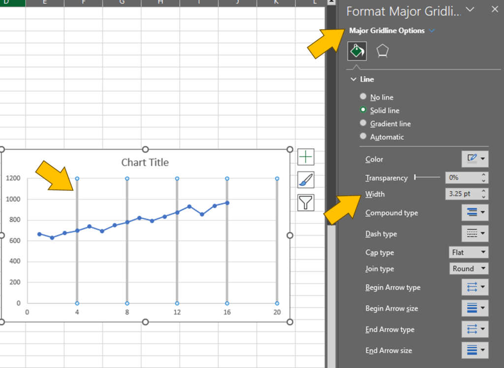
7. Modify Major Axis Gridline
R
ts(data, start, end, frequency) → create time series object
imported_earthquakes <- ts(data=Earthquakes$earthquakes)

plot(imported_earthquakes,
     main="title here",
     xlab="Year",
     ylab="Magnitude")
Result:

imported_sales <- ts(data=sales$Sales,
                     start=c(2007, 7),
                     frequency=4)

plot(imported_sales,
     main="title here",
     xlab="Year",
     ylab="Sales")
Result:


Leave a comment