
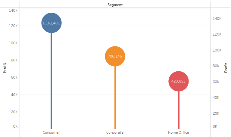
Lollipop Chart
Tableau
Note:
– Overlay technique

1. “Segment” to Columns
2. “Profit” to Rows
3. “Segment” to Color
4. Do “Profit” again but this time Marks Circle
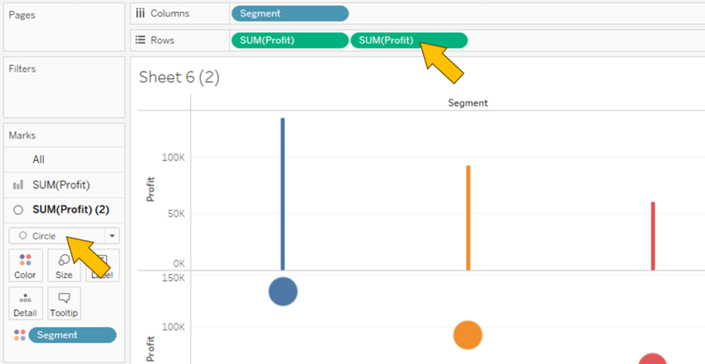

5. Combine 2 plot together using Dual Axis
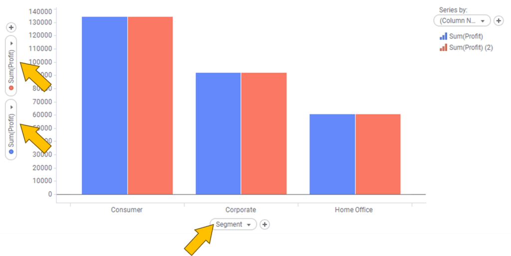
Spotfire

Note:
– In Combination Chart, no capability to set Color by attribute, only by series
– no capability to create circle; hack using Line Marker

1. Click on Visualization Types button and select Combination chart
2. “Segment” to X Axis
3. “Profit” to Y Axis, twice
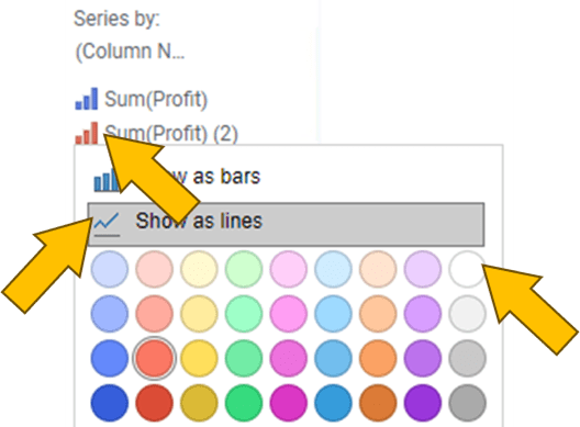
4. Head to legend and click on the small bar chart icon of “Sum(Profit) (2)”
5. Click on Show as lines
6. Select White
In Properties 🡒 Appearance
7. Reduce size of Bar Width
8. Reduce Line width
9. Increase Marker Size


Leave a comment