
Bump Chart
Tableau
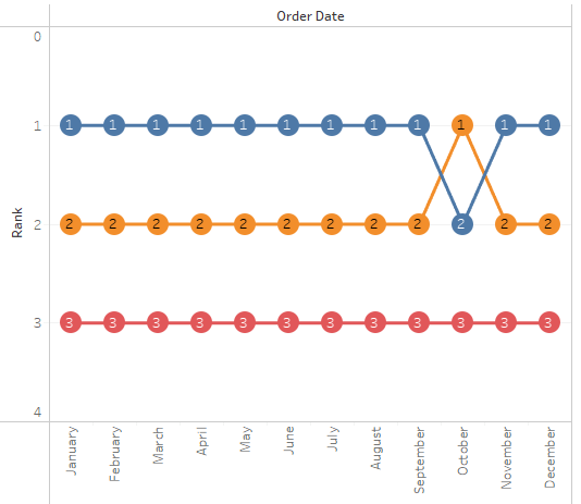
Note:
– Overlay technique
– Ranking and aggregation is calculated during plot initialization
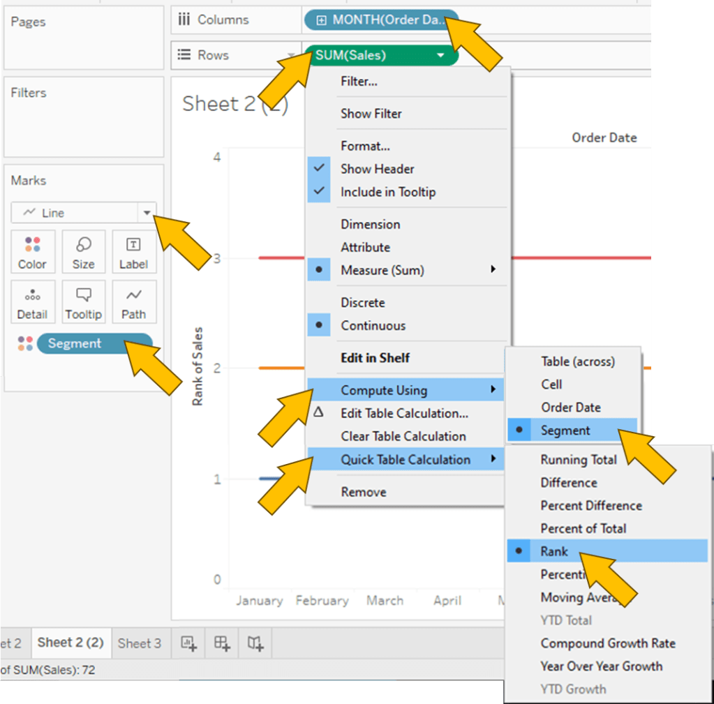
1. “Order Date” to Columns
2. “Sales” to Rows
3. “Segment” to Color
4. Do “Sales” again but this time Marks Circle

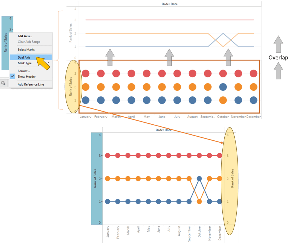
5. Combine 2 plot together using Dual Axis
Spotfire
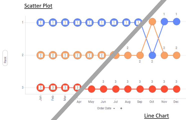
Note:
– Can be done using line chart (w. Marker) or scatter plot (w. Line Connection)
– Ranking and aggregation is perform on whole dataset

1. Click on Visualization Types button and select Scatter plot
2. Open Up Column Properties Menu.

3. Create 3 new Calculated Column
| Sum Sales By Segment Month | Sum([Sales]) OVER (Intersect([Segment],[Order Date (Month)])) |
| Order Date (Month) | Month([Order Date]) |
| Rank | DenseRank([Sum Sales By Segment Month],”desc”,[Order Date (Month)]) |
4. “Order Date (Month)” to X Axis
5. “Rank” to Y Axis
In Properties 🡒 Line Connection
6. Select “Segment”


Leave a comment